
SPARE PARTS
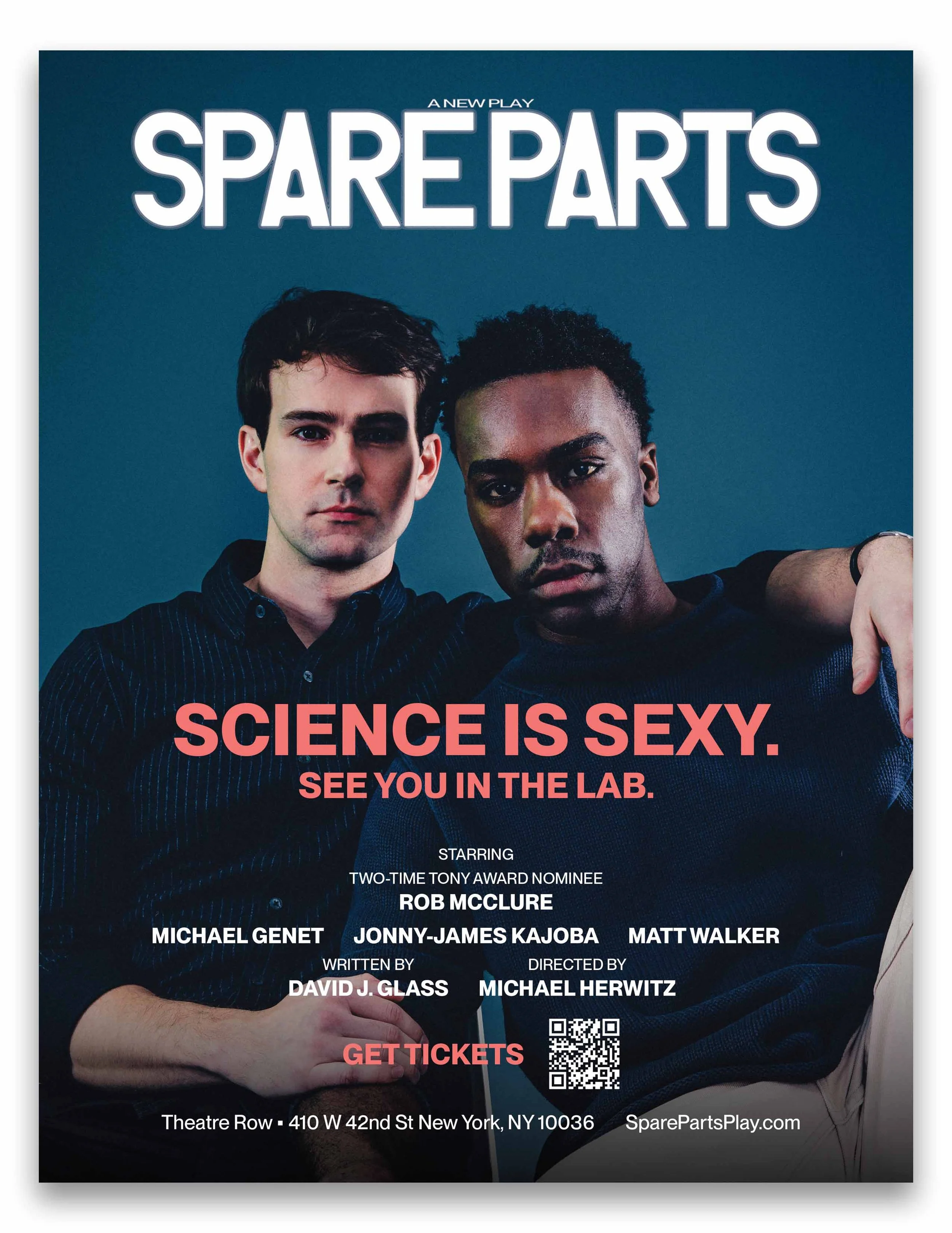
As the sole designer at Table 7 Strategy, I took over the creative from the team at Spare Parts once we acquired the production. The challenge throughout this process was figuring out how to integrate the old with new while aiming to keep a clear identity in place.
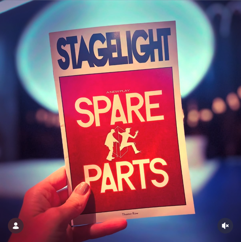
The original artwork felt very dark while the second image was very…red, which when you think of color psychology, it’s hard to get that to work a lot of the times in a campaign on its own.
Original creative from client
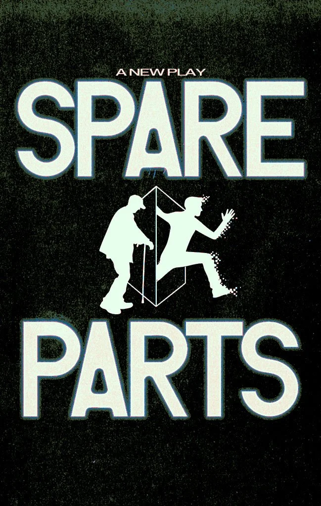
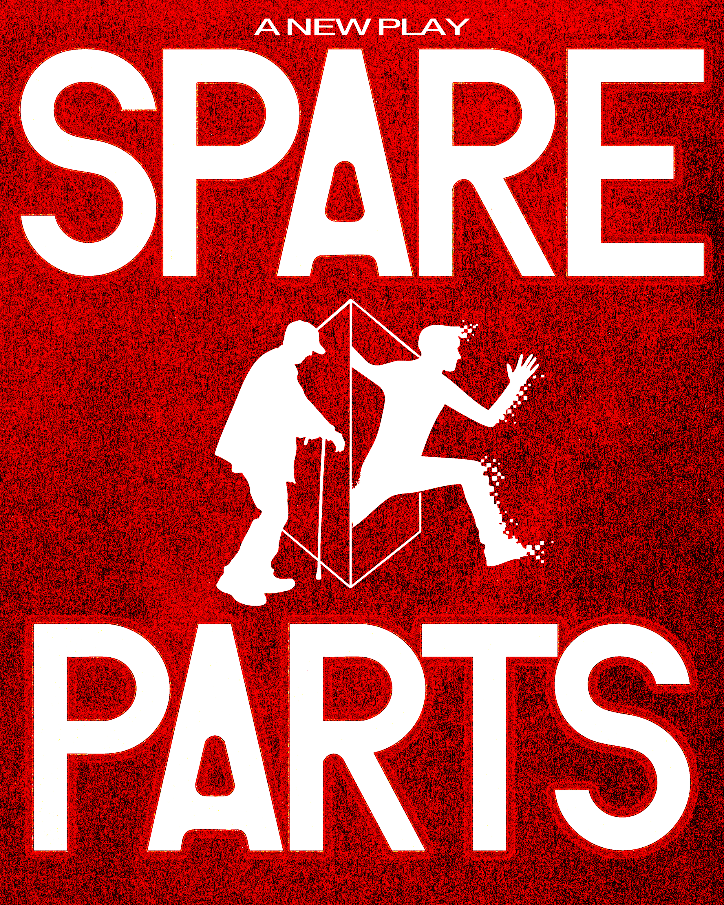
The show was about cheating death and obtaining everlasting youth. Having dark and twisted themes, social wanted to use surgical instruments in the content and asked if I could make a glitching effect.
I pulled some colors from the artwork to develop a new palette.
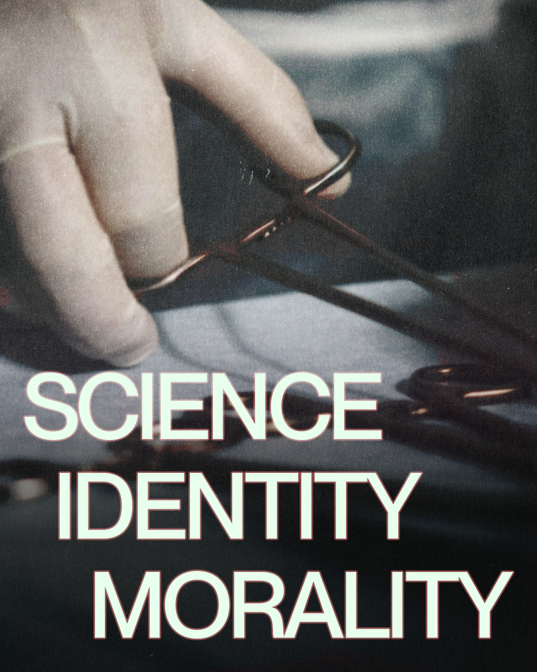
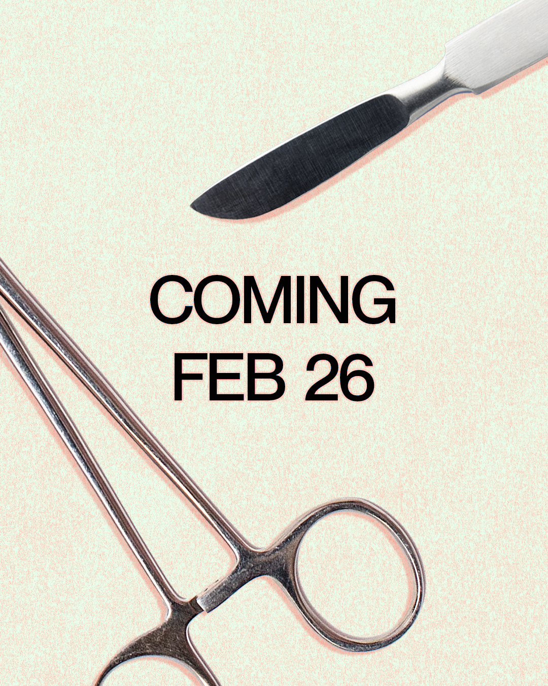

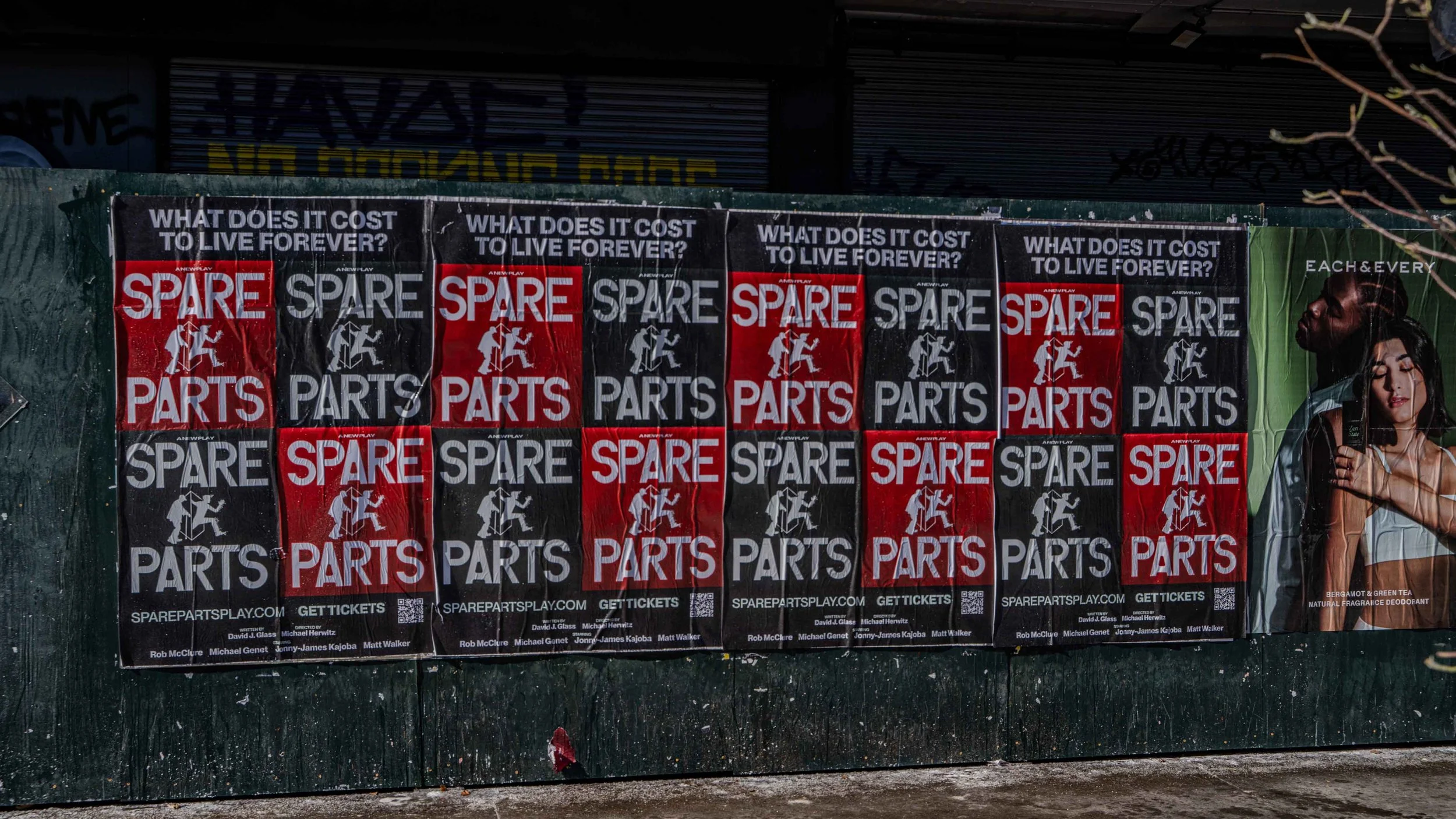
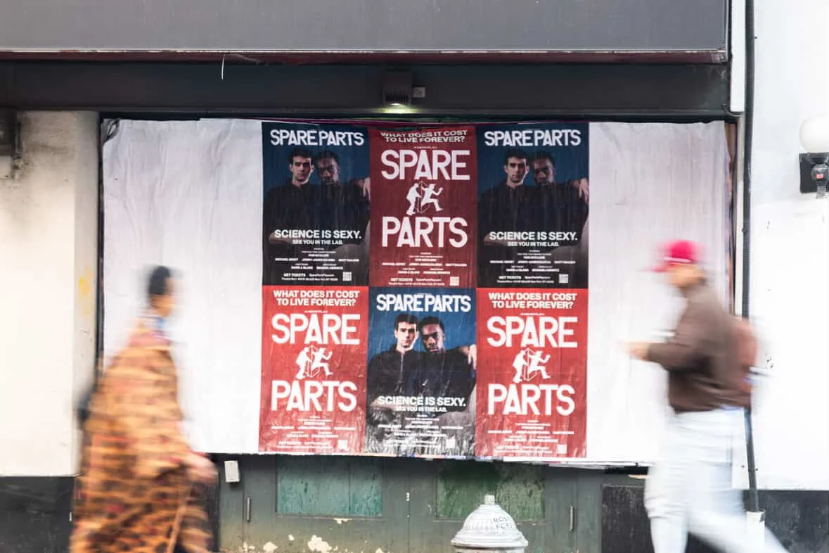
Ah, a photoshoot. After the photoshoot, we started to integrate that into the collateral. I dropped the icon. There was still a push to use the red artwork, and in this case, make it a “checkerboard effect” as you can see in the first Wildpostings billboard above. Red was still favored over the salmon color, and then no red at all, but was eventually approved as an accent.
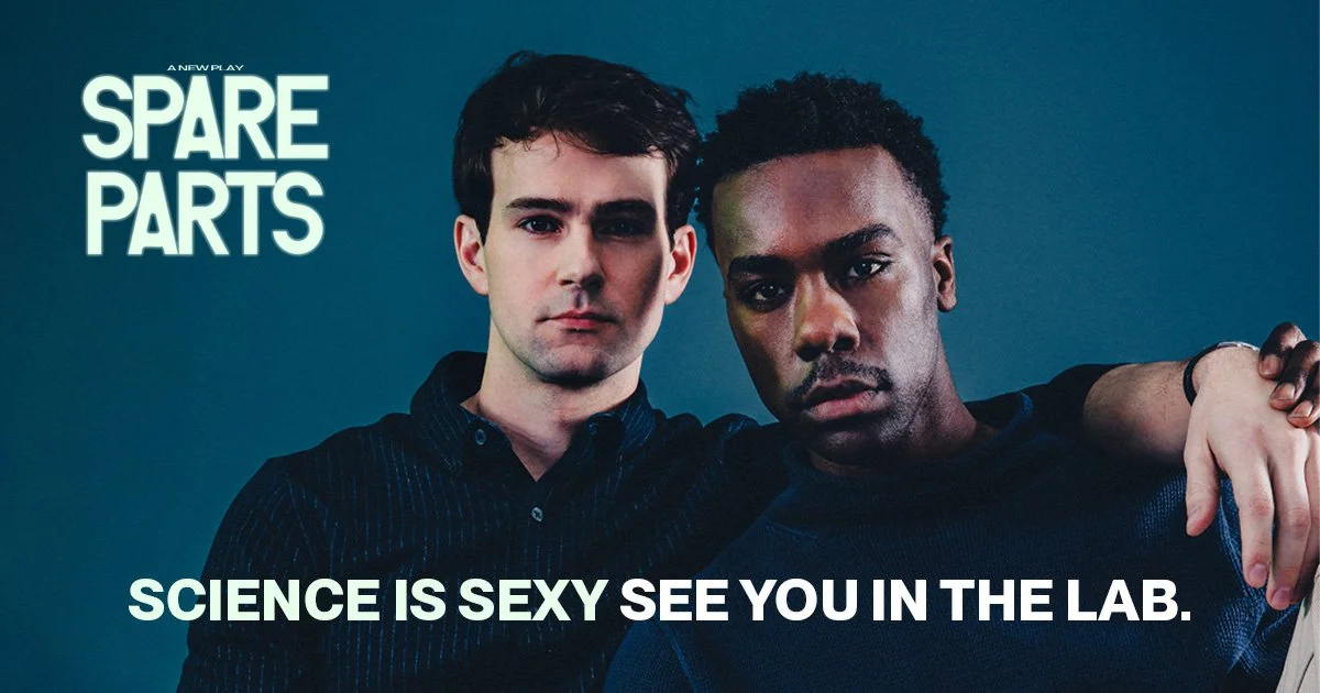
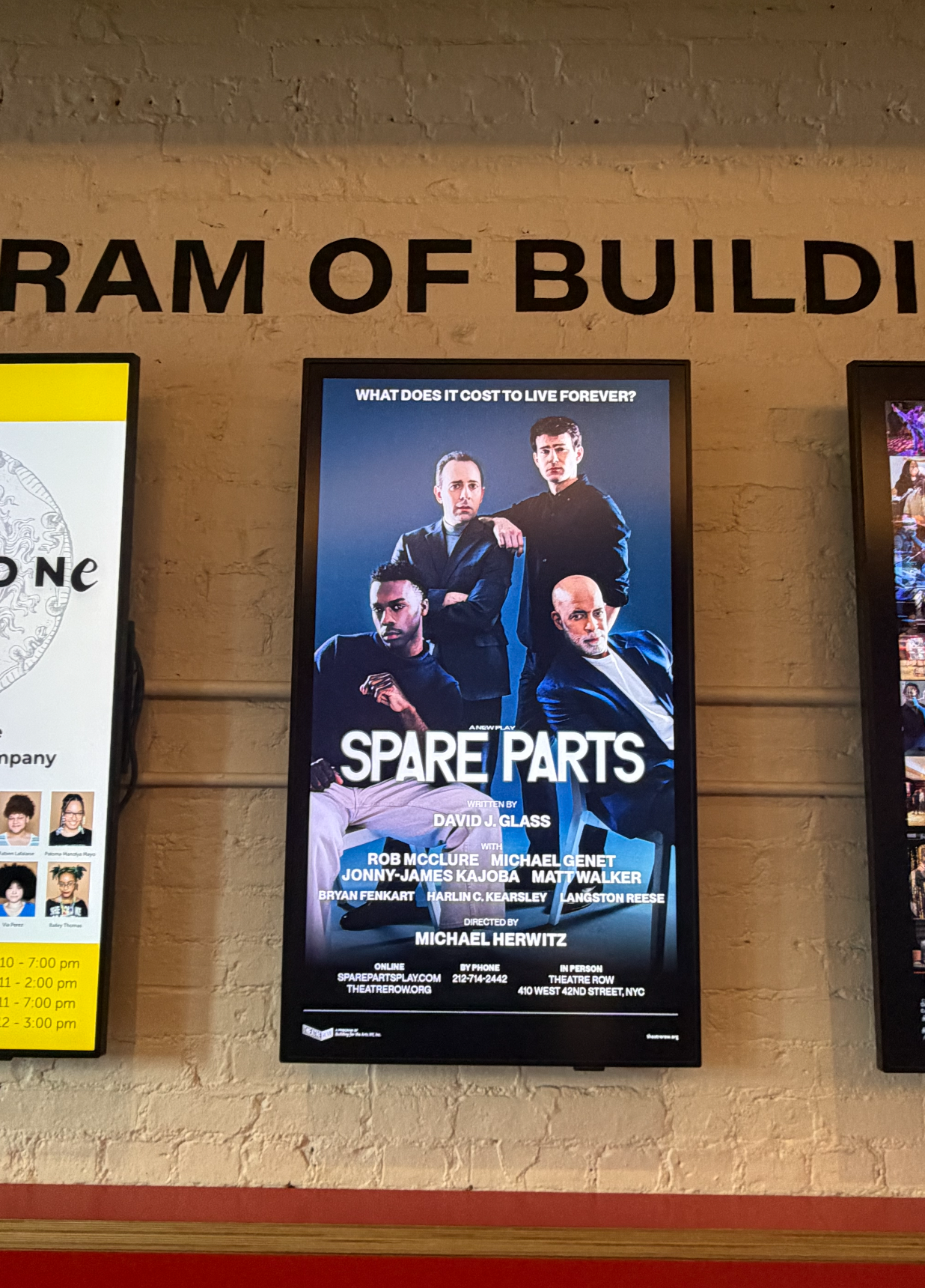
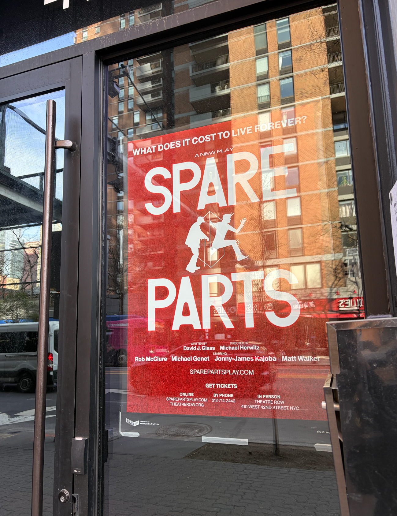
One thing remained a favorite, the animation I did in the first promo.
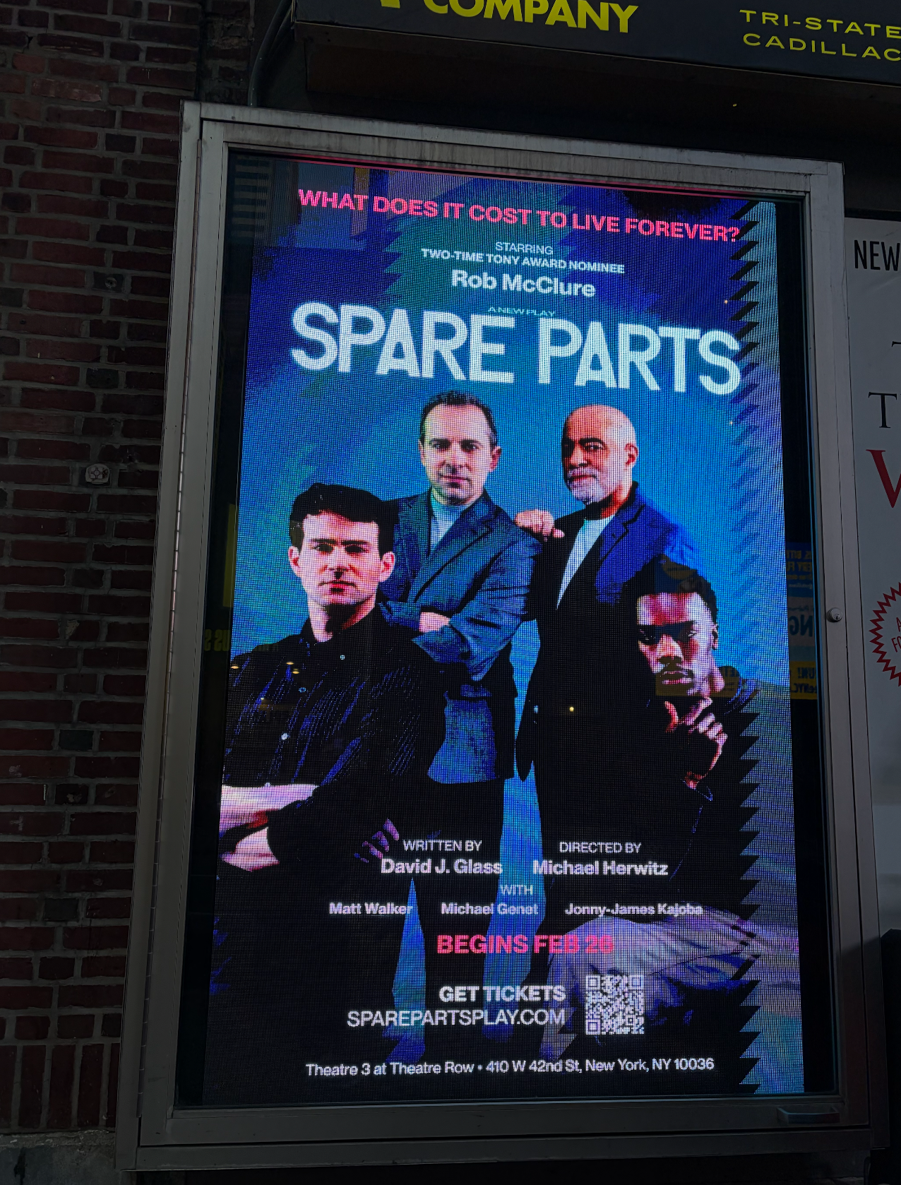
My favorite part… (I feel like I’m writing in school) is the bottom half below. Strong contrast in color, type, while keeping it “all in the family”. By this point we got into a rhythm that stuck.
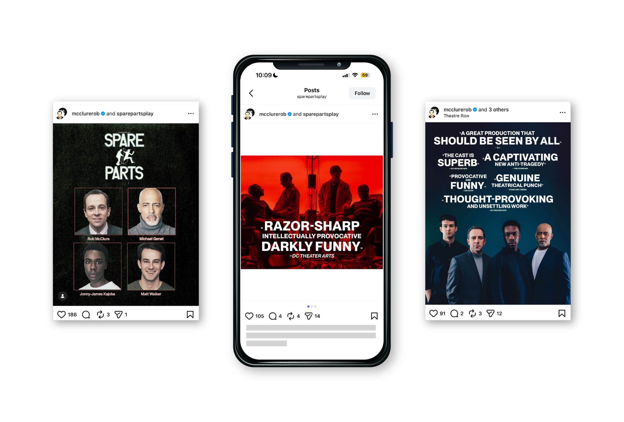
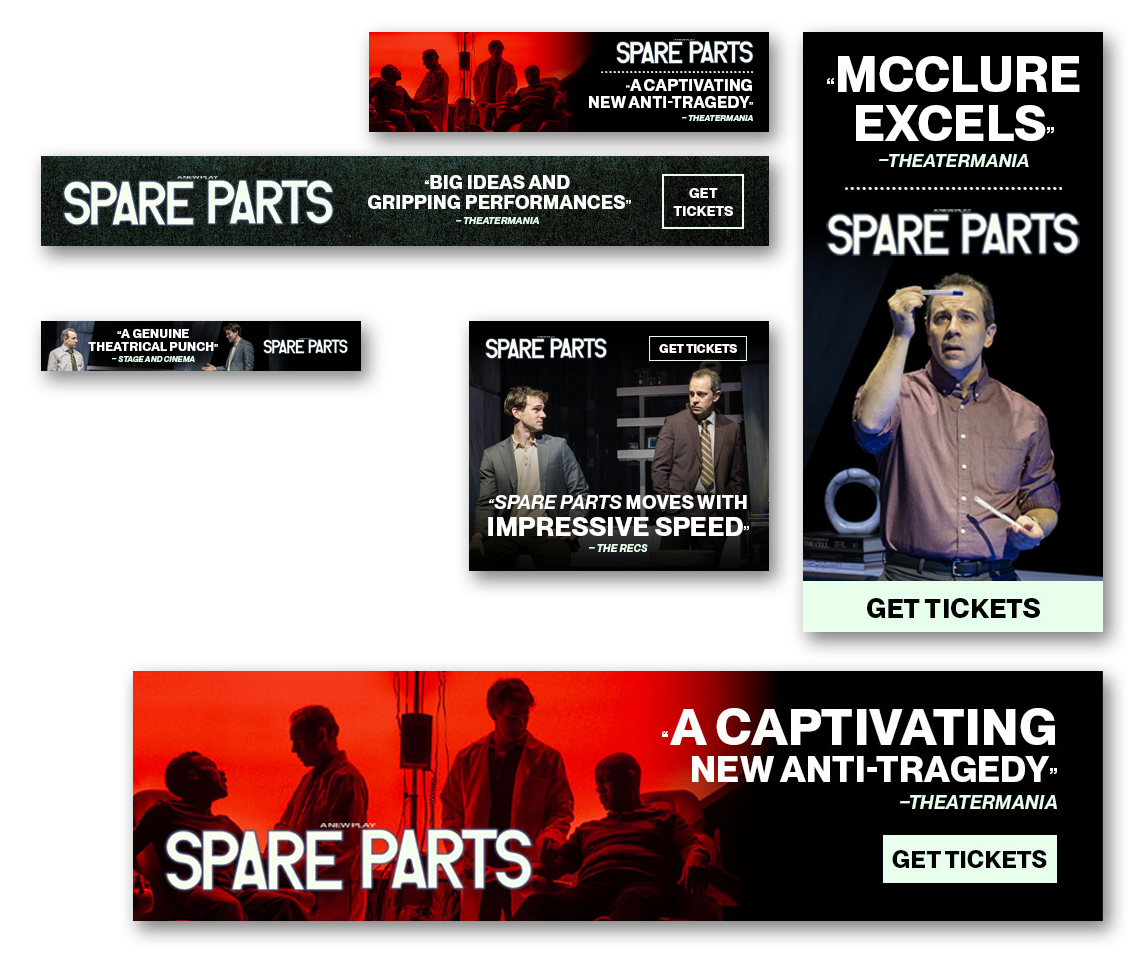
SPARE PARTS
Expansion of Brand Identity & production design across all touchpoints
Created at Table 7 Strategy
Ran at Theatre Row
Original Key Art: Julian Alecia
Photography for new Key Art: Marc J. Franklin