
Banner Ads
Client: Eastern Atlantic States Regional Council of Carpenters
(Agency - Mosaic Strategies)
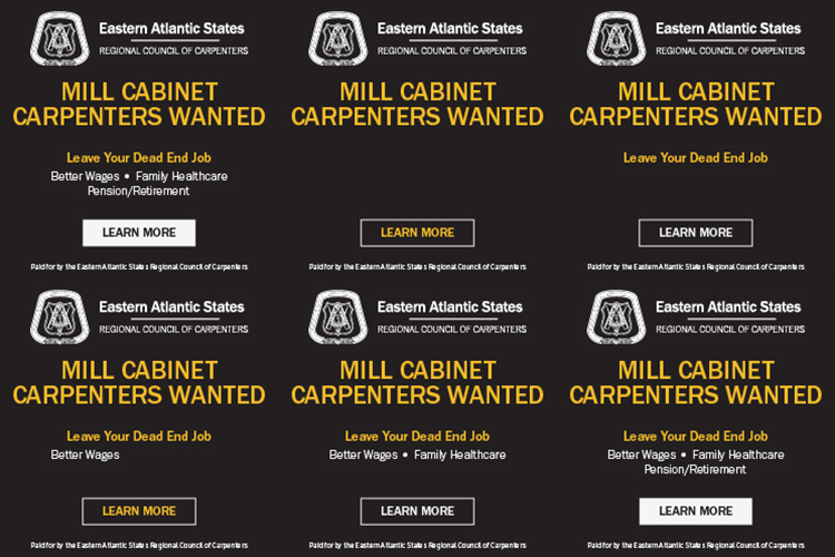
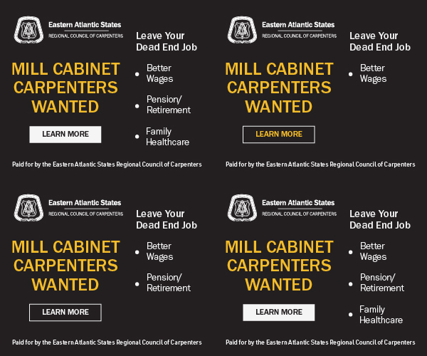
I created an “in-between” style guide to merge styles prior to starting these assets as the client was in-between brands. I thought about my audience, carpenters looking for work, and what they’d focus on first. That’s how I figured out my typographical hierarchy.
Read more below.
-
When I first started these ads, my initial response was to seek out the style guide for this client in order to ensure they were branded properly. I learned that we were in between brands, meaning there was an old and new style. I grabbed assets from both and created an “in-between” style guide to merge styles instead of going full force into the new one, as advised by my project manager.
-
I thought about my audience, carpenters looking for work, and what they’d focus on first. That’s how I figured out my typographical hierarchy. I wanted the ad to rotate out the bullets and decided it would make sense to portray those by flashing everything first and then showing the other slides one by one, so there wasn’t any dead space.
Client: Wendy Davis
(Agency - Mosaic Strategies)
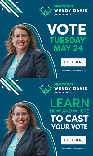
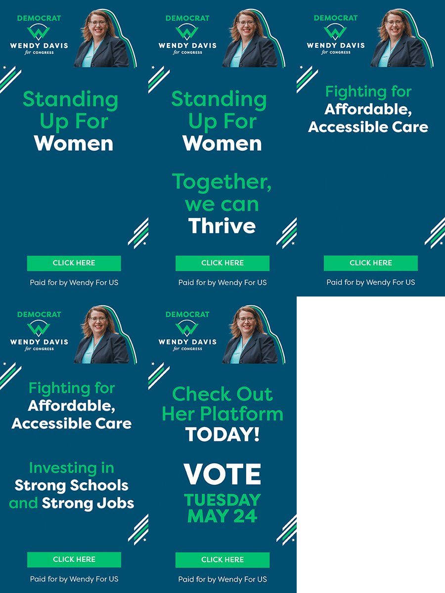
I identified brand and style elements (lines and stars) from previous graphics that would help the ads pop and create more of a design besides just text.
I had fun playing around with the typography to see how I could stack it as a unit with the focus words standing out.
Read more below

-
I first started out by digging through the client’s previous graphics, created by another agency in order to identify some brand and style elements that would help the ads stand out as well as tighten the design up. I then re-created the line elements that were already used and added the lines beside the photograph to emulate a style that was in one of the earlier graphics (solid color blocks of her outline).
In the case of the first set (square one below) I had fun with the typography where I really enlarged the key terms “vote” “learn” “to cast” as well as made them one unit stylistically.
The challenge the 2nd set presented (the rectangular ad) was how to sustain the audience’s attention with as much text as was on the ads. One way I did so was by chunking the information together so it read as parts instead of one line after another. The other way was through the typeface’s style - color and weight.
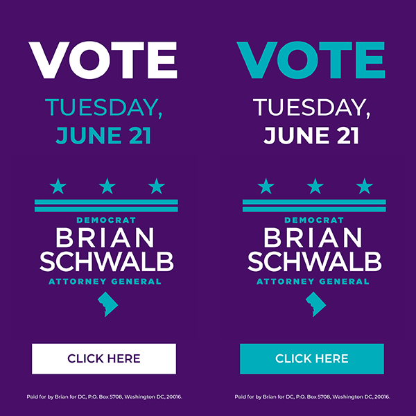
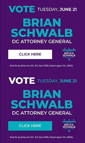
Client: Brian Schwalb
(Agency - Mosaic Strategies)
The challenge was redundancy - having so much text, how do I create variety within the design?
Read more below

-
The challenge here was redundancy: there wasn’t much variety in the content I was using to create these ads. I had his logo as well as his name. At first I had both included but learned that depending on the size, the logo alone would suffice and thus create some break in design because it incorporated some elements besides just text (as shown in the vertical ads.